There is something quietly emotional about calligraphy. Before a guest even reads the details, the lettering already says something. It suggests care, patience, beauty, and a sense of occasion. That is why calligraphy wedding invitations have stayed so loved, even as wedding stationery trends shift from year to year.
Calligraphy does not belong only to grand ballroom weddings or traditional ceremonies. It can feel romantic, modern, rustic, artistic, minimal, or dramatic depending on the style. A sweeping script on handmade paper tells one story. A clean modern calligraphy font on a simple white card tells another. The real charm is in how personal it feels, as though the invitation was created slowly and thoughtfully rather than simply printed and sent.
Why Calligraphy Feels So Special for Wedding Invitations
Wedding invitations are not just practical pieces of paper. They are the first formal glimpse guests receive of the celebration. The venue, dress code, season, and mood are often hinted at long before anyone arrives. Calligraphy helps create that feeling because it adds softness and personality to the design.
Unlike plain typed text, calligraphy has movement. The curves, strokes, spacing, and slight imperfections bring warmth. Even printed calligraphy can make an invitation feel more graceful and human. It gives the sense that this event matters, that it has been prepared with intention.
For many couples, calligraphy also feels timeless. Trends may change, but beautiful lettering rarely looks out of place. It can be styled to feel classic or fresh, which makes it a flexible choice for almost any kind of wedding.
Classic Calligraphy for Formal Weddings
Traditional calligraphy is often associated with elegance, and for good reason. Long, flowing letters, graceful flourishes, and balanced spacing can make an invitation feel refined without needing too much decoration. This style is especially suited to formal ceremonies, evening receptions, historic venues, country clubs, and black-tie weddings.
Classic calligraphy often works best with a restrained color palette. Ivory, white, soft grey, champagne, deep navy, and black all pair beautifully with elegant script. A simple card with the couple’s names in calligraphy and the remaining details in a clean serif font can look polished and easy to read.
The key is balance. Too many flourishes can make the wording difficult to follow. When traditional script is used thoughtfully, it creates a sense of romance without feeling heavy or old-fashioned.
Modern Calligraphy With a Relaxed Mood
Modern calligraphy has a looser, more expressive look. It often uses uneven baselines, playful curves, and a more casual rhythm. This style feels less formal than traditional script but still beautiful. It is a lovely choice for garden weddings, outdoor celebrations, beach ceremonies, intimate dinners, and creative city weddings.
One reason modern calligraphy wedding invitations are so popular is that they feel personal without being too proper. The lettering can look almost handwritten, which gives the invitation a warm and natural quality. It pairs well with minimalist layouts, soft watercolor backgrounds, line drawings, and muted earthy tones.
Modern calligraphy also works beautifully when used sparingly. The couple’s names, the phrase “save the date,” or a single romantic line can be written in calligraphy while the rest of the text remains simple. This keeps the design stylish and readable.
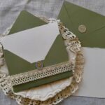
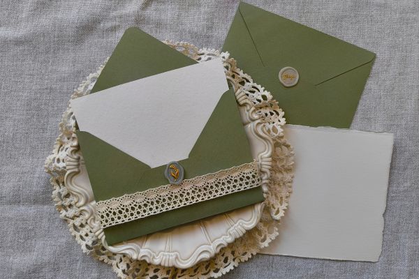
Handmade Paper and Soft Romantic Details
Calligraphy and handmade paper are a natural match. The texture of handmade paper, especially with deckled edges, gives the lettering a gentle, artistic feel. It looks slightly imperfect in the best way, as though every invitation has its own character.
This style suits romantic, vintage, fine art, and countryside weddings. Soft ink colors such as charcoal, dusty blue, olive, warm brown, or muted rose can add depth without overpowering the paper. Some couples also choose vellum overlays, silk-style ribbons, wax seals, or dried floral accents to complete the look.
It is easy to add too many details, though. Calligraphy already brings beauty to the invitation, so the surrounding elements should support it rather than compete with it. A simple ribbon or one delicate envelope liner is often enough.
Minimalist Calligraphy Invitations
Minimalist invitations prove that calligraphy does not need to be elaborate to make an impact. A clean card with plenty of white space and one graceful calligraphy detail can feel modern, calm, and very sophisticated.
For minimalist designs, the font pairing matters. A flowing script can be combined with a neat sans serif or a classic serif typeface. The contrast allows the calligraphy to stand out while keeping the practical details clear. Black ink on white card is always elegant, but softer combinations like taupe on ivory or sage on cream can feel warmer.
Minimalist calligraphy is ideal for couples who want something stylish but not overly decorated. It works well for modern venues, small weddings, civil ceremonies, and couples who prefer quiet beauty over ornate design.
Rustic and Bohemian Calligraphy Styles
For rustic or bohemian weddings, calligraphy can feel softer, freer, and more organic. Instead of polished perfection, the lettering may have a hand-drawn quality. It can be paired with kraft paper, botanical illustrations, terracotta tones, pressed flower details, or earthy textures.
This style feels especially natural for barn weddings, woodland ceremonies, outdoor receptions, and relaxed weekend celebrations. A slightly imperfect script can look charming alongside warm neutrals, dried grasses, wildflowers, and natural paper.
Bohemian calligraphy often works best when it feels effortless. The design should not look too arranged. A loose floral sketch, soft torn edge, or informal wording can help the invitation feel welcoming and personal.
Calligraphy for Envelope Addressing
Even when the invitation itself is simple, calligraphy on the envelope can create a beautiful first impression. Hand-addressed envelopes feel intimate because guests see their own names written with care. It turns the act of receiving the invitation into a small moment.
Envelope calligraphy can match the invitation style or provide a little contrast. A formal invitation may use traditional script, while a relaxed wedding might use modern calligraphy with softer movement. Ink color can also make a difference. White ink on a dark envelope feels dramatic, while black or brown ink on handmade paper feels natural and understated.
For couples working within a budget, calligraphy can be reserved for outer envelopes, names, or special details rather than the full invitation suite. This keeps the look elegant without requiring every element to be hand-lettered.
Digital Calligraphy and Printed Designs
Not every calligraphy invitation needs to be written entirely by hand. Digital calligraphy and calligraphy-inspired fonts can create a similar mood while making production easier. Many couples choose a design that includes hand-lettered names or custom script, then have the final invitations printed.
This approach is practical for larger guest lists and can still feel personal when the design is well done. The important thing is to choose lettering that looks natural rather than overly perfect or generic. Some fonts can feel stiff, while others carry the movement and charm of real handwriting.
Printed calligraphy also allows couples to experiment with color, layout, and paper finishes. Letterpress, embossing, and simple digital printing can all work beautifully depending on the style and budget.
Choosing the Right Calligraphy Style
The best calligraphy style is the one that matches the wedding’s overall feeling. A formal ballroom wedding may call for elegant traditional script. A beach wedding may look better with relaxed modern lettering. A countryside ceremony might suit handmade paper and organic strokes. A city wedding could feel perfect with minimalist calligraphy and sharp typography.
Readability should always come first. Wedding invitations carry important information, and guests should not struggle to understand names, dates, times, or locations. Calligraphy can be artistic, but it should still serve the message.
It also helps to think about the full stationery suite. Save the dates, invitations, menus, place cards, programs, and thank you cards can all include touches of the same lettering style. They do not have to match perfectly, but a consistent mood makes the wedding details feel connected.
Conclusion
Calligraphy wedding invitations have a lasting appeal because they bring feeling to the page. They can be grand or simple, formal or relaxed, traditional or modern. More than anything, they make the invitation feel considered. Every curve and stroke adds a little softness to the practical details of date, time, and place.
For couples choosing their stationery, calligraphy offers a beautiful way to set the tone before the wedding day arrives. Whether it appears across the entire invitation, just on the couple’s names, or only on the envelope, it creates a sense of care that guests notice. In a world where so much communication is quick and digital, a thoughtfully lettered wedding invitation still feels wonderfully personal.